
When building a new website, you want to start with solid foundations. Welcome to Fluidal!
Typical page builders give you a myriad of options and promise endless flexibility. However, such levels of control often result in a page being difficult and slow to edit or update and the website being impractical to display at every screen size.
Standard page builders can also come with significant overheads such as crippling site speed.
Fluidal takes away all of that pain.


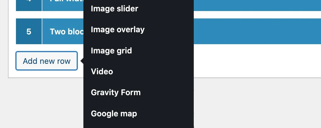
We’ve carefully refined the levels of control for every Fluidal row, so you know that whatever content you create will always be displayed in a reliable way. This means every type of content and row that you add to a page will always work at every screen size. Leaving you more time to focus on the content and presentation.
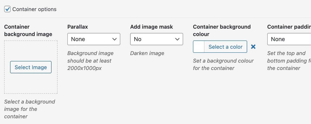
As well as each row having its own specific options, there are common controls for every container wrapper too, including background colours, images, image masks, parallax, padding, height and vertical alignment.
Plus you always have the ability to override every row by creating your own CSS classes and IDs as well.


We don’t rely on third-party premium add-ons or endless plugins. Just good old fashioned robust, reliable code. Fluidal was built for speed and precision.
With the foundations taken care of, the focus can then shift to the content and how the website is finished, integrating whatever plugins or additional styling and functionality may be required.